Looking closely
How composition guides the eye in a painting
Explore how balance, emphasis and movement shape where you look in a painting, with a practical exercise and a look at Syeda Saima Afia’s Feeling as a contemporary example.
Qurbart Studio · 2 November 2026 · 4 min read
Seeing visual weight
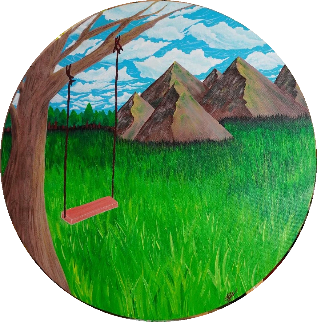
When you first glance at a canvas, the areas that feel heaviest pull your attention. Balance distributes that weight across the surface, so the eye settles without feeling tipped. In Syeda Saima Afia’s Feeling, the dark storm cloud occupies the upper left, countered by a lighter horizon on the right, creating a subtle equilibrium that steadies the viewer’s gaze. The Getty’s Principles of Design note that balance “distributes visual weight,” a rule that works even when the subject is abstract.
The weight of the cloud is not only size; colour depth and texture add density. The lighter sky, rendered in thin washes, feels airy, inviting the eye to drift toward it after the initial pull of the cloud. Recognizing these cues helps you map where a painting wants you to linger before moving on.
Spotting emphasis through contrast
Emphasis is the spotlight that tells the eye where to pause. Contrast—between light and dark, saturated and muted, or detailed and smooth—creates that spotlight. In Feeling, the stark white highlights on the cloud’s edge contrast sharply with the muted blues behind, drawing the eye to the cloud’s edge before it slides down the canvas. Getty’s Principles of Design describe emphasis as “directing attention through contrast,” a technique that works across styles.
If the same cloud were painted in a uniform grey, the focal pull would lessen, and the viewer might wander aimlessly. Noticing how contrast shapes emphasis lets you anticipate where the artist has placed narrative weight, and it offers a quick way to decide which parts of a work deserve closer study.
Following movement across the canvas
Movement is the invisible path the eye follows, often suggested by lines, shapes or implied motion. In Feeling, the sweeping curve of the cloud’s underside creates a gentle arc that guides the gaze toward the lower right corner, where a faint horizon line hints at a landscape beyond. This subtle direction aligns with Getty’s description of movement as “the path the eye follows through a composition.”
A viewer who lets the eye travel along that curve experiences a sense of progression, as if the clouds are moving across a sky. If the curve were broken or the cloud fragmented, the eye might jump erratically, disrupting the narrative flow. Observing these pathways helps you understand the story the artist is sketching with visual cues.
A practical looking exercise
Try this: stand before a painting and, without naming any elements, trace the route your eye takes with a finger. Note where it pauses longest—that’s emphasis. Notice which side feels heavier—that’s balance. Finally, follow the line you feel the eye is pulled along—that’s movement. Record your observations on a notebook; you’ll start to see patterns that repeat across works.
Apply the exercise to Feeling. You’ll likely feel the eye drawn first to the dark cloud, linger on its highlighted edge, then glide along its curve to the lighter horizon. By practicing this simple routine, you build a habit of reading composition, making future viewings quicker and more rewarding.
What if the composition changed?
Imagine cropping Feeling tighter, cutting off the lower horizon. The balance would shift, leaving the dark cloud dominant and the lighter sky missing, making the piece feel heavier and more oppressive. The movement arc would end abruptly, reducing the sense of journey and leaving the eye without a clear exit point. This hypothetical shows how small compositional tweaks can alter emotional impact.
Conversely, expanding the canvas to include more sky would lighten the overall weight, perhaps turning the piece into a meditation on openness rather than tension. Such thought experiments illustrate that composition is not static; it’s a set of choices that shape meaning. Considering alternatives sharpens your ability to read the artist’s intent and to envision how you might adapt a work for your own space.
A fair counterpoint and next steps
While composition guides the eye, personal experience also colors perception. Two viewers may agree on where the eye lands but feel different emotions because of their own histories. Recognizing this limitation reminds us that formal analysis is a tool, not a definitive verdict on meaning. It’s useful to pair visual reading with the artist’s own statements for a fuller picture.
If you’re curious to see how these principles play out in a real work, explore Feeling on Qurbart’s site. The painting’s page offers the artist’s brief statement and high‑resolution images to practice your new skills. When you feel ready, you can inquire about a commission or discuss how composition might work in a space you love.
Sources & editorial note
Prepared by Qurbart Studio with AI assistance, grounded in the sources below. Artist statements belong to S. Saima Afia. Editorial text is not a personal statement from the artist.
Getty: Principles of DesignFeeling – Qurbart product page