Artist stories
Al-Wahda: unity, courage and three sacred places
Aqsa, the Kaaba and Madeena share a red ground in Al-Wahda. Saima Afia’s notes explain the colour, the directions of the light and the year between beginning and finishing.
Qurbart Studio · 1 November 2026 · 4 min read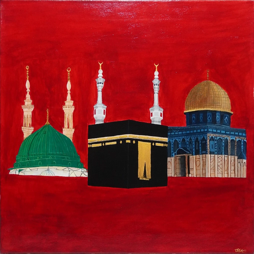
Three places, held together
Al-Wahda means “the unity” or “the union.” In this painting, Saima Afia brings Aqsa, the Kaaba and Madeena into one composition. Her notes give the red background a particular meaning: boldness and courage, with the sacrifices and resistance associated with these places in mind. The story begins there, in her choice to hold them together rather than describe each one separately.
The places remain distinct. A green dome and cream minarets sit on the left. The black-and-gold Kaaba occupies the centre. On the right is a gold-domed blue building representing Aqsa. The red continues around them all. Looking across the painting, you can follow those differences without losing the sense of a shared ground. Its title offers a way into that relationship.
Why the background is red
Red is one of the first things you notice in Al-Wahda. It surrounds the buildings and remains visible between them, giving the pale minarets, green dome and gold details something strong to stand against. Before reading the artist’s note, you might respond to that colour in your own way. Saima’s explanation then makes her intention clear: she chose it for boldness and courage.
Her statement also speaks of sacrifice and resistance. That matters when spending time with the work. The background carries a meaning she has named; treating it only as a colour that might suit a room would leave part of the painting’s story behind. Reading her words beside the image brings that meaning into view. Red becomes a place to pause, with her explanation in mind.
Light from different directions
Saima describes a different direction of light for each place: from the left for Aqsa, from the right for Madeena, and from the front for the Kaaba. In her explanation, this front lighting gives the Kaaba its central importance. These are directions of illumination. They should not be confused with where the buildings sit: Aqsa’s representation is on the right of the picture, while Madeena is on the left.
With that distinction in mind, return to the painted surfaces. Look at the pale architectural details beside the darker Kaaba, then at the gold and green domes. You can move between the three and notice how differently they meet the light. Saima’s note gives you something specific to look for while leaving room for your own response to the whole painting.
A beginning in 2024, a finish in 2025
The painting also holds a pause in its making. Saima says she began it in September 2024 and found it difficult to continue because she was “afraid of ruining my perfect sketch.” She records its completion in September 2025. Before the finished work, there was a sketch she cared about enough to hesitate over. That hesitation is part of the story she chose to share.
Read her words next to the finished painting and the sketch no longer feels like an invisible first step. It belongs to the history of the work. The photograph shows the completed composition; the note lets us know that continuing it was not simple. We have both the image and this small account of what making it asked of her.
Spend a little longer with the surface
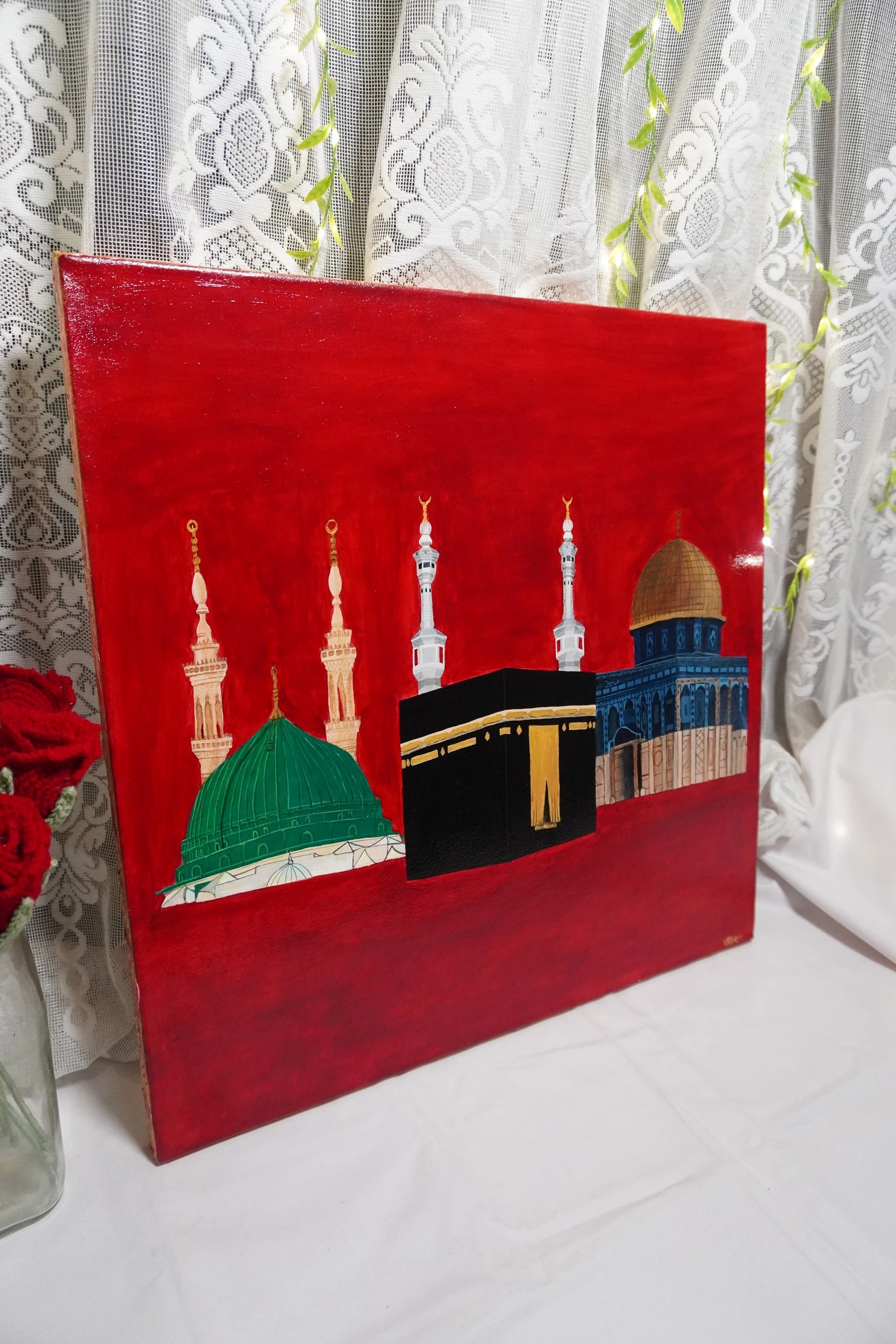
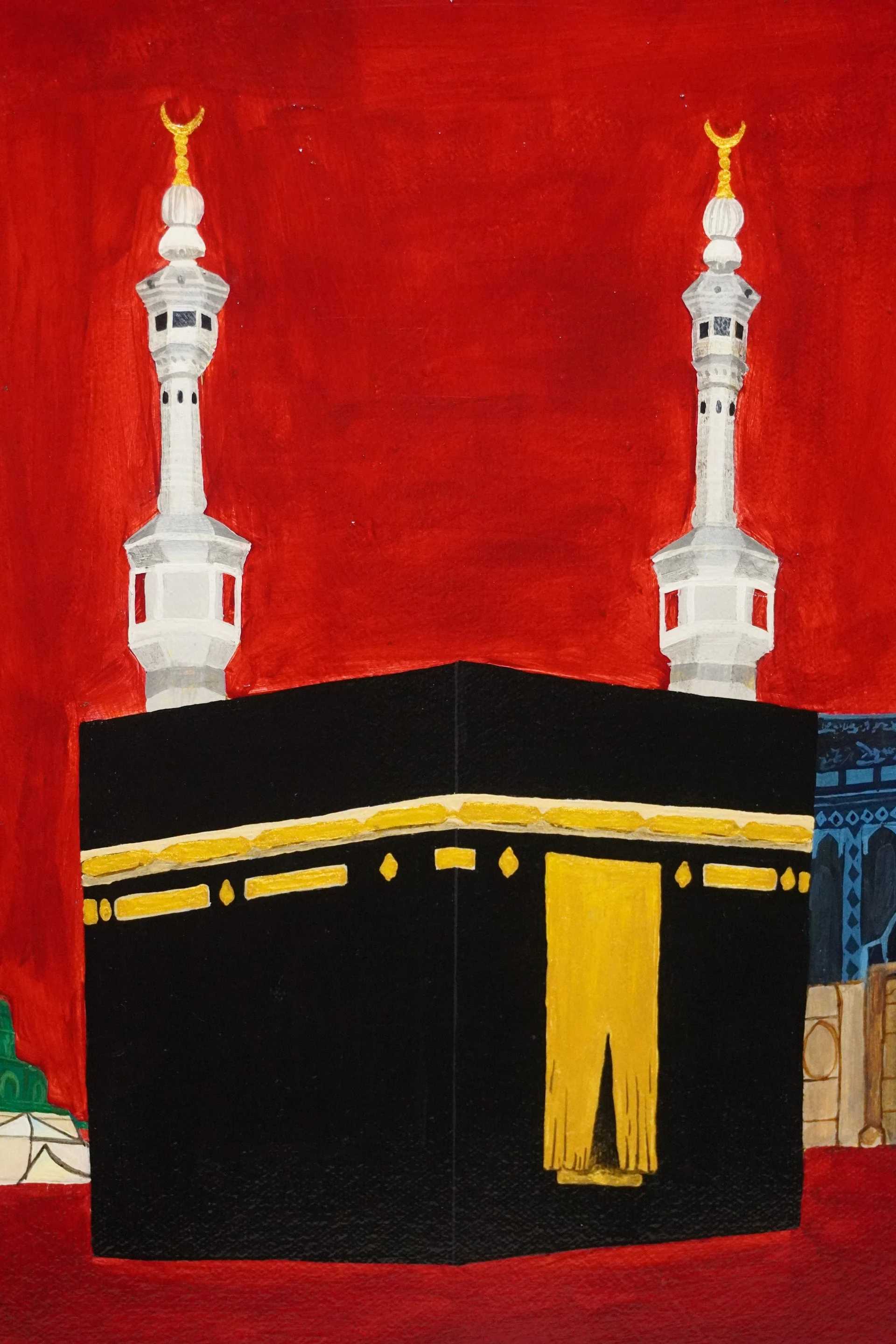
The studio photographs offer another way to look. One shows Al-Wahda upright against a lace curtain; a closer photograph brings the Kaaba, white minarets and red painted marks nearer. Moving between the complete image and a detail can help you see what the smaller view leaves out. The whole shows the relationship between the places. The detail lets you linger with the painted surface.
Try looking once before reading the note, then once after. Notice where your eye stops first and whether the explanation of red or light changes what you attend to. There is no need to arrive at a grand conclusion. You may simply find that a particular edge, colour or passage of light holds your attention longer on the second look.
Read the artist’s note beside the painting
The Al-Wahda product page brings the work and Saima’s statement together. It is the source for the title’s meaning, her explanation of red and light, and the dates described here. If you are considering the painting for a space, begin with those details. Check the current listing and ask about anything you need to know before making a decision.
You can return to the painting through the link below and read her words alongside it. If a different place or memory is what you hope to have painted, Qurbart’s commission form is also linked. Share what matters to you in your own words. That can begin a conversation with Saima about a custom painting, with its direction shaped by the person and the artist together.
Sources & editorial note
Prepared by Qurbart Studio with AI assistance, grounded in the sources below. Artist statements belong to S. Saima Afia. Editorial text is not a personal statement from the artist.
Al-Wahda – Qurbart product page