Art & ideas
Does the same colour mean the same thing in every painting?
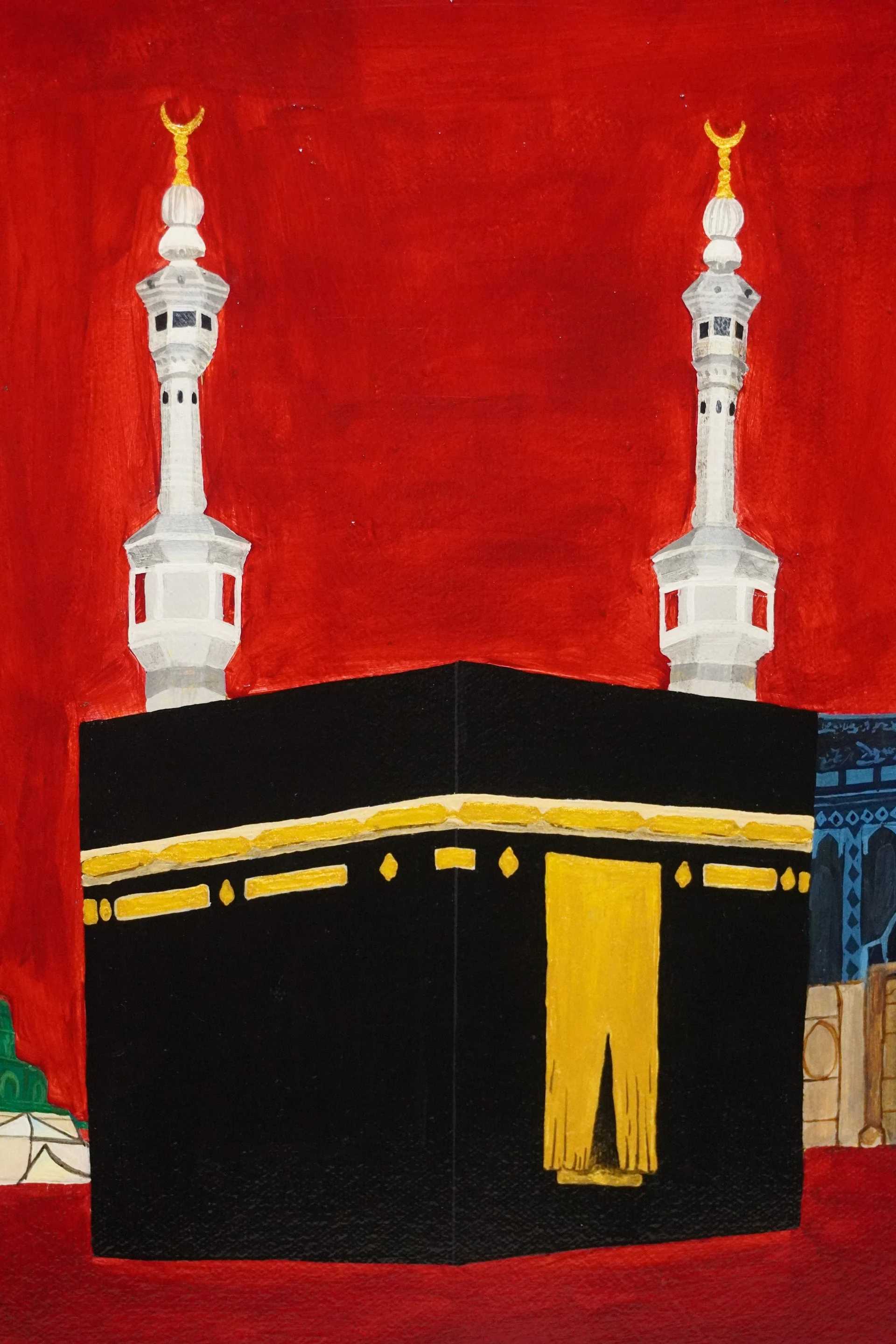
Colour is a language that shifts with context. In Saima Afia’s Al‑Wahda the red background speaks of courage and sacrifice, but that same hue can feel warm, angry or romantic elsewhere. By looking closely at a work’s setting, symbols and artist intent, we learn that colour meanings are never fixed.
Qurbart Studio · 3 November 2026 · 3 min read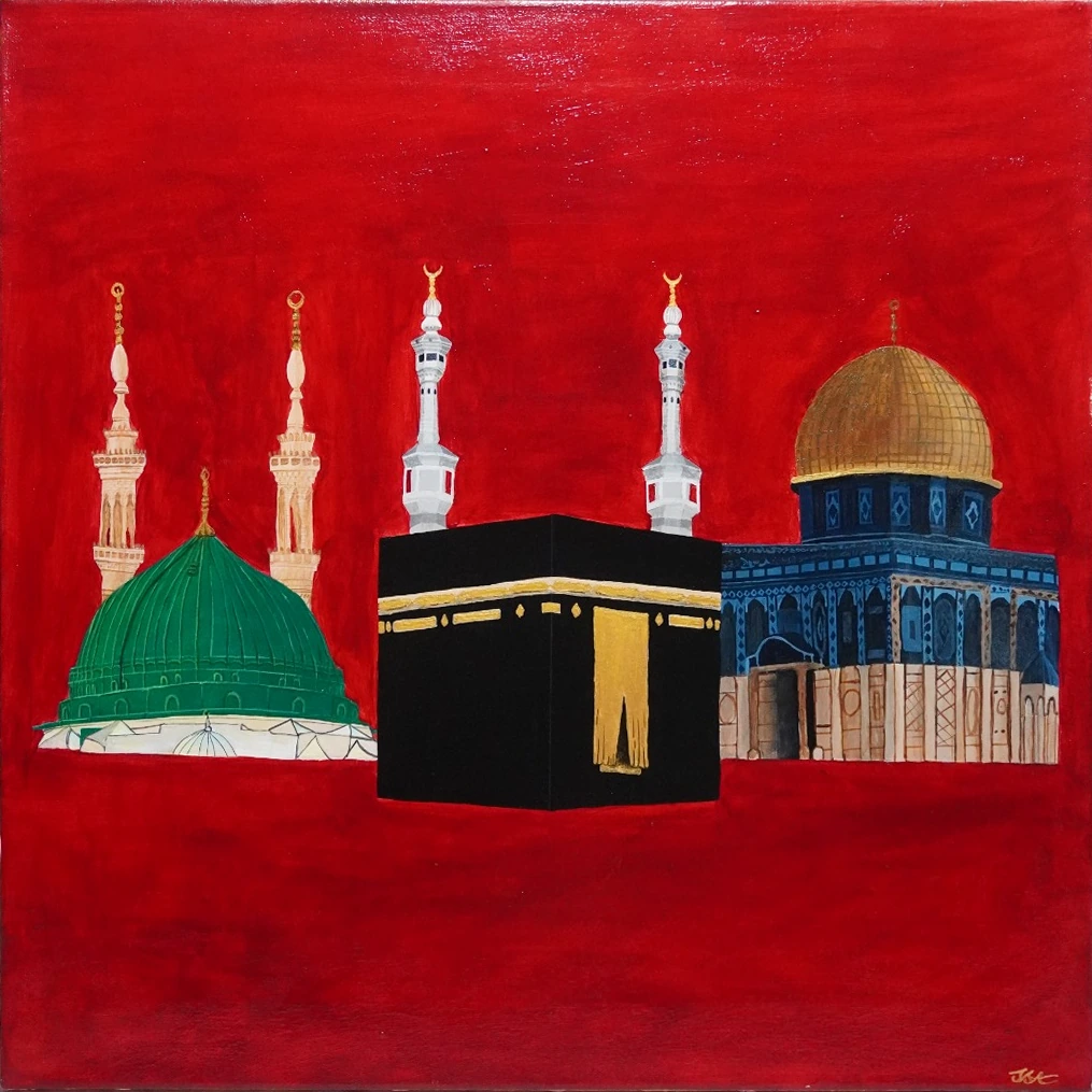
Colour is not a universal code
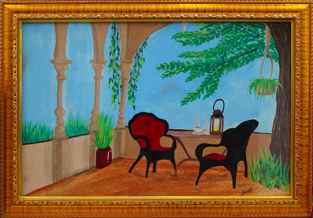
Colour in painting is a tool, not a fixed sign. The Getty explains that line, shape, form, space, colour and texture provide a vocabulary for describing visible choices, but a depicted surface does not automatically convey a universal meaning. Each work invites its own narrative.
The National Gallery of Art reminds us that close looking at colour, line, shape, form and texture helps people describe and compare works. Interpretive responses are not universal psychological effects, meaning that a single hue can carry many different messages depending on context.
Saima Afia’s intent for red in Al‑Wahda
In Al‑Wahda, Saima Afia chose a red background to represent boldness, courage, sacrifice and resistance. The artist herself notes that the colour “represents boldness and courage” and that the sacred places she depicts “asked for many sacrifices and resistance in order to just exist.”
This statement shows that the artist’s intention is specific and tied to the painting’s subject: three holy sites of Islam. The red is not a generic symbol of love or danger, but a deliberate reference to the struggle surrounding those places.
Context shapes perception
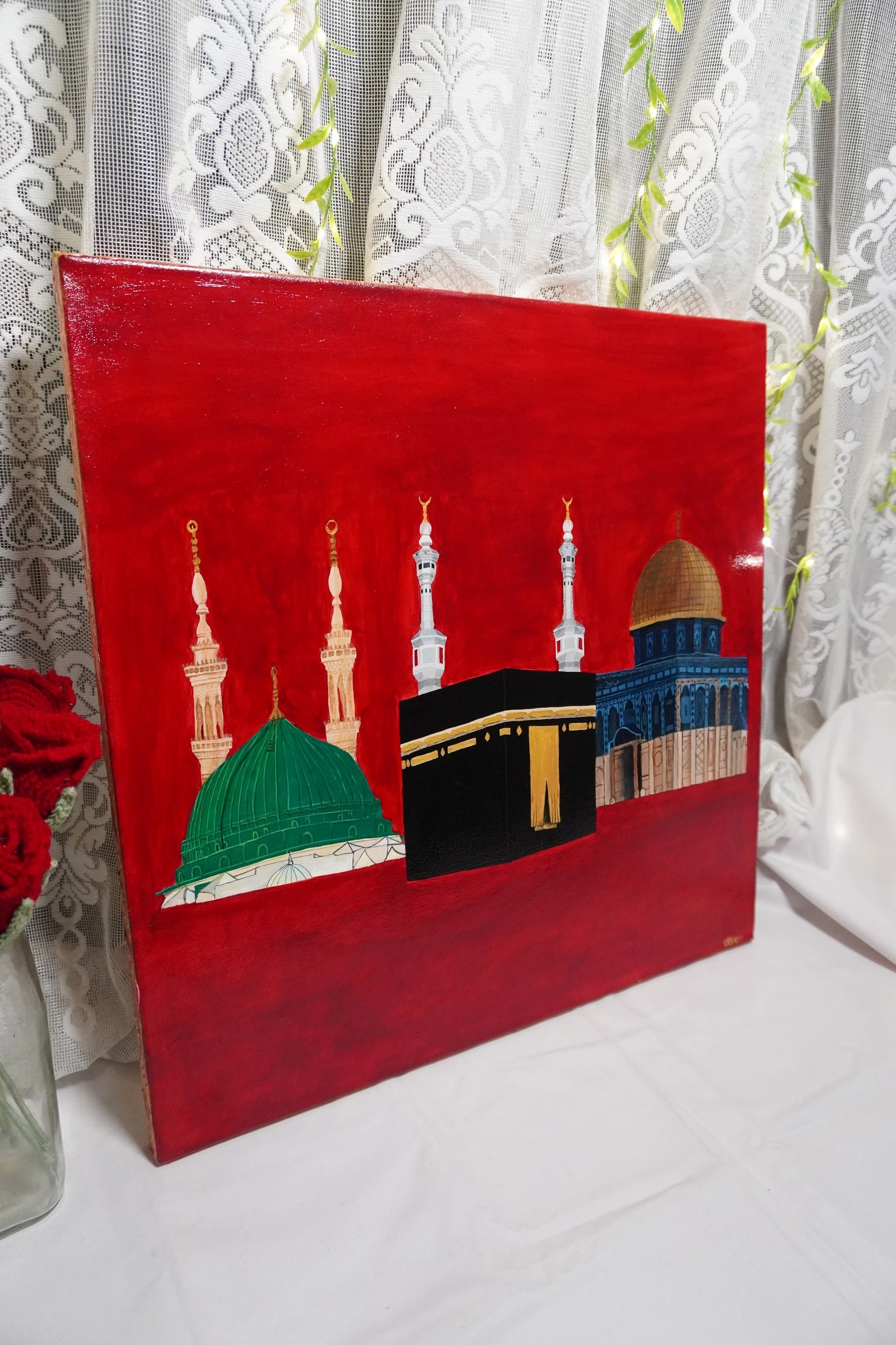
When a viewer sees a red landscape, the first reaction might be warmth or passion. In Al‑Wahda, however, the red’s meaning is anchored by the composition: a green‑domed minaret, a black‑and‑gold Kaaba and a gold‑domed blue building all set against that same backdrop. The lighting directions further reinforce the hierarchy and sacredness of each site.
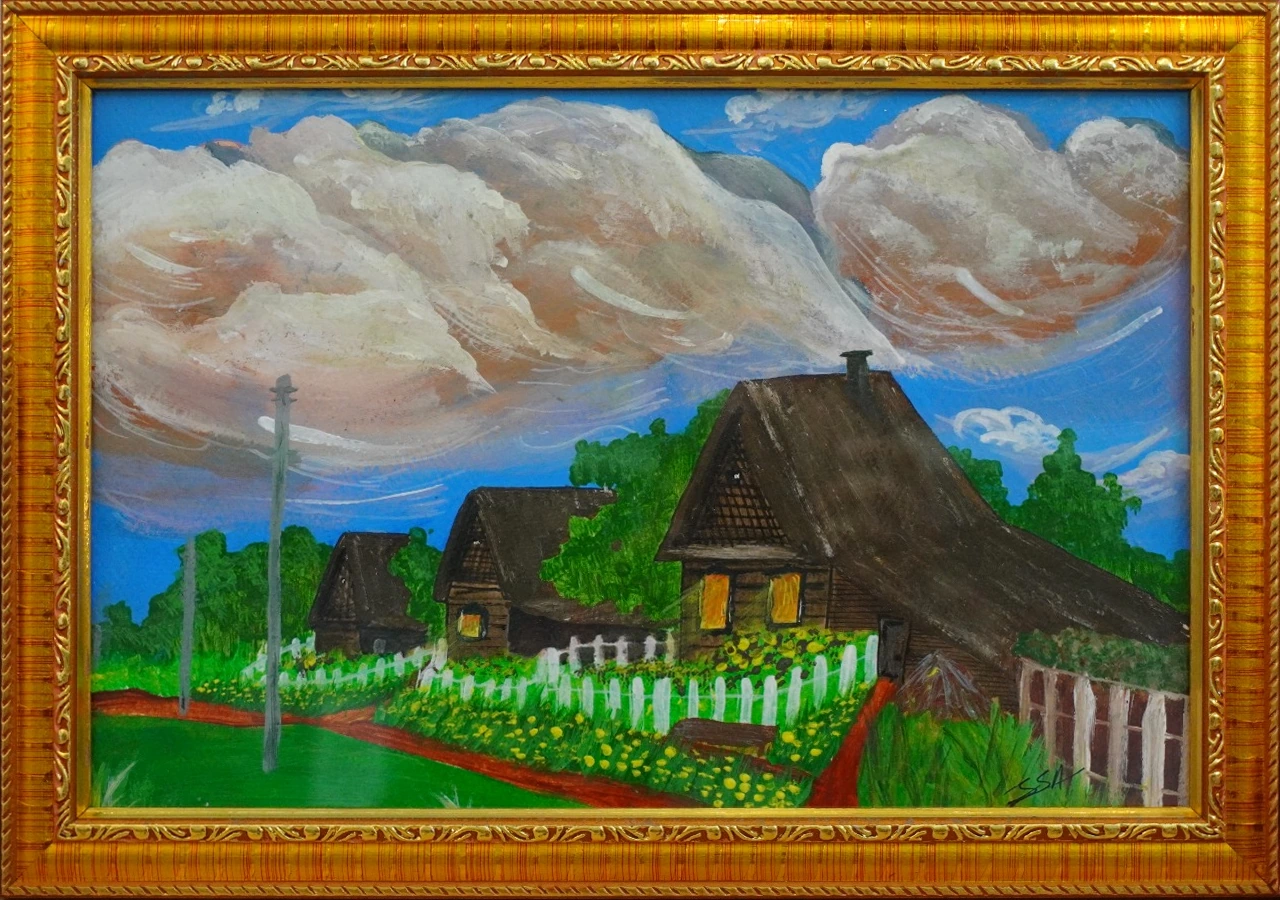
Because the painting’s context—religious symbolism, historical struggle and cultural memory—provides a frame, the same red hue can feel dramatically different. A red in a pastoral scene would not carry the same connotations of resistance and unity.
Separate intent from interpretation
It is tempting to read universal colour rules into a painting, but doing so ignores the artist’s stated purpose. Saima Afia’s explanation of red is a clear example of how intent can guide meaning. Viewers should note the artist’s words, then consider how their own experience might add layers without overriding the original message.
By distinguishing between what the artist says and what the viewer feels, we respect the work’s integrity while allowing personal resonance. This practice prevents overgeneralizing colour symbolism across all artworks.
A practical looking exercise
When you next view a painting, pause and ask: What does the artist say about the colour choices? If the statement is absent, look for contextual clues—subject matter, composition, lighting, cultural references. Then note how your own feelings align or diverge. Record both the artist’s intent and your personal reaction in a short journal entry.
This exercise trains you to see colour as a language that is both specific and open, helping you appreciate each work on its own terms.
A fair counterpoint
While context is crucial, it is also true that some colours can evoke similar emotional responses across many works. Warm reds often feel energetic, and cool blues can feel calm. These tendencies are part of shared visual language, but they do not override the unique narrative each artist constructs.
Recognizing both the universal tendencies and the particularities of a painting allows for a balanced, nuanced appreciation.
Sources & editorial note
Prepared by Qurbart Studio with AI assistance, grounded in the sources below. Artist statements belong to S. Saima Afia. Editorial text is not a personal statement from the artist.
Getty: Elements of ArtNational Gallery of Art: The Elements of Art